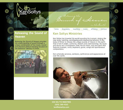
I really liked the circly- things on the left and right of the KSM site. I originally was going to use black behind the text but found it made the text look ugly so I switched that to white.

There are some neat roll-over effects on the buttons along the left side.(my first time making and using sprites, for you web dev people out there). I've re-worked the header quite a few times to get the text to be legible so you can read the name of the church. I like what we have now.

We still have some issues to work out with the content of some of the pages (mostly the 'live music' page). They can all be viewed by clicking on the photo.


No comments:
Post a Comment